Can you imagine the Facebook logo being red, bright yellow or any other color? The entire look and feel of your newsfeed would be altered. Maybe even to the point of wanting to gravitate to another social media platform. Though choosing a color for your mobile app development project may seem arbitrary at first thought, it could mean the difference between success and mediocrity. Fortunately, color psychology has been studied extensively and you can apply the science directly to your business.
Culture Shapes Color Psychology
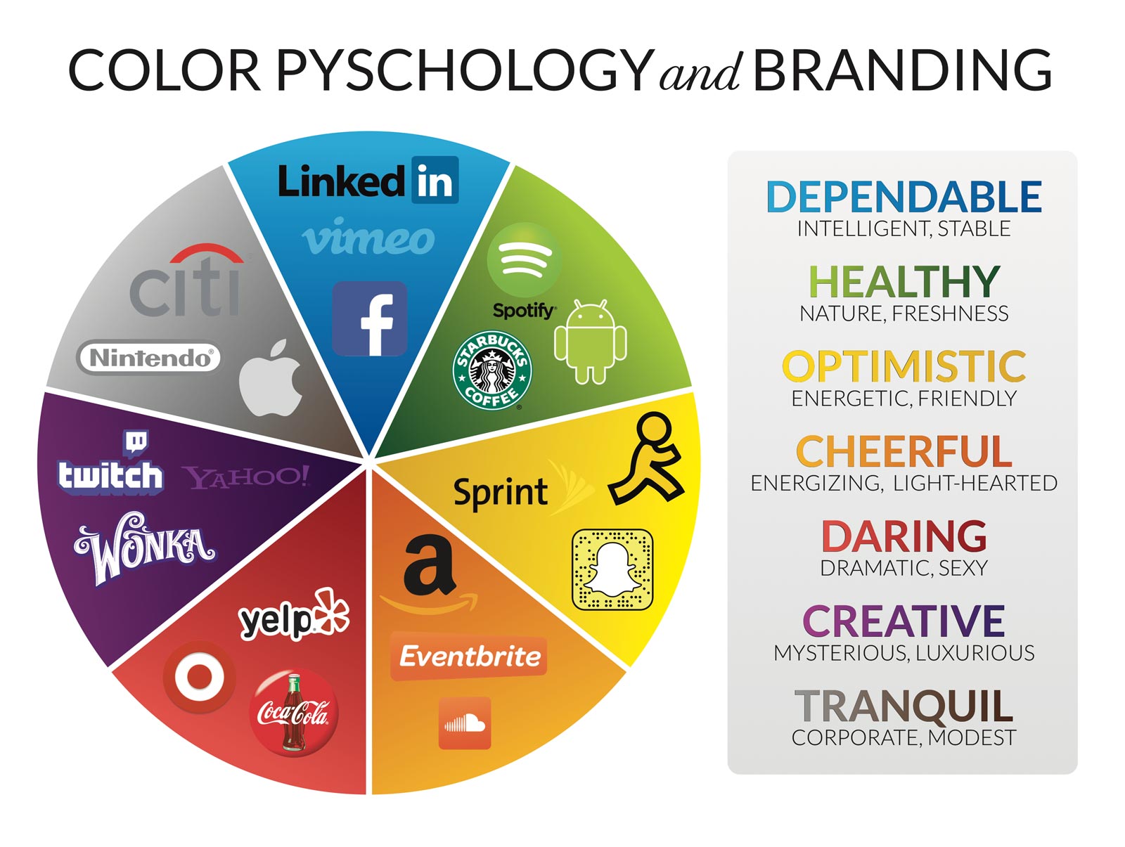
While much of the research on color psychology holds a great deal of truth, a person’s color preferences are dependent on personal experiences and background. Culture also plays a huge role in color preference, which is noticeable when you compare the United States, India, Mexico and countless other countries. In U.S. culture, we associate red with companies like Coca-Cola and Target, blue with Facebook and Chase Bank, green with Starbucks, and so on.
The color wheel below shows several company logos, from the tech world and otherwise, along with the emotions their color is meant to embody. Do you agree with the words associated with each color?

The Numbers Don’t Lie
According to a study from Emerald Insights, up to 90% of the initial judgments made about a product or brand are based on color alone. Kissmetrics found that color accounted for up to 93% of the reason consumers purchased a particular product. They also found that companies who used the same color throughout their branding experienced an 80% increase in brand awareness.
The Class Favorite
A worldwide study on color psychology found that blue is the most popular color amongst men and women across 10 countries and four continents. Perhaps this phenomenon has influenced Facebook’s overwhelming success. After all, the company does have 1.86 billion monthly active users and counting. Mark Zuckerberg is actually red-green deficient, which means blue is the color he sees most clearly. His color-blindness may have led the company to default to its current color scheme–a silver lining to his limited perception of color.
Contrast is Key
According to an infographic from Hubspot, color can also increase comprehension by 73%. This insight means that color isn’t just important for your branding, but also the navigability of your app, website and other content. For instance, Hubspot conducted an A/B test on red and green call-to-action buttons viewed by 2,000 site visitors. Their red button resulted in 21% more conversions than the green one. Dmix conducted a comparable test on 600 visitors that resulted in a similar, albeit more dramatic result. Their red button produced 34% more conversions than its green counterpart.
Practical Application
Needless to say, sticking to a color that represents the personality of your brand is extremely important. Likewise, using contrasting colors to guide users through your app is equally significant. After all, conversions are the goal!
But don’t just take our word for it. A/B testing your favorite colors and designs is essential to getting the optimal performance out of your app, as well as your brand. If you need more guidance on creating a brand and user experience that stands out, SevenTablet’s talented UI/UX designers can help create a captivating design that yields conversions. Contact us to get started.


